UI Security - Thinking Outside the Viewport
Introduction
When it comes to an application’s user interface (UI), one may care for the aesthetics, design consistency, simplicity, and clarity to ensure a good UI. However, an application like a browser where untrusted content is loaded, parsed, and given APIs to invoke all sorts of UIs then a new layer of concern appears: Designing secure UI.
Over the years it has become apparent that browser UIs will be abused in techniques such as phishing campaigns and tech support scams. Usually, the goal in these attacks isn’t to execute code on the victims’ machine, but rather to gain the trust of the victim and convince (or scare) them into simply calling a number. These kinds of techniques are often referred to as social engineering attacks, and they are hard to fully mitigate since any untrusted page can display any image they like. Even still, it is important to ensure that a browser’s UI does not facilitate such attacks. As we will see, unsecure UI design can even lead to the extraction of private information from the user; including credit cards, passwords and addresses. Along with these logical security issues we will see, like any large C++ project, memory safety problems can be present even in the UI code.
In this blog post I will share a general guide on how to spot UI security issues and then discuss some of the bugs that have been found relating to UI security.
UI Security Checklist
Ask yourself the following set of questions when assessing if a given UI is secure or not. It usually takes multiple of the following checks to fail to constitute an abusable UI security bug.
1. Does it cross the visible viewport (AKA Line of Death )?
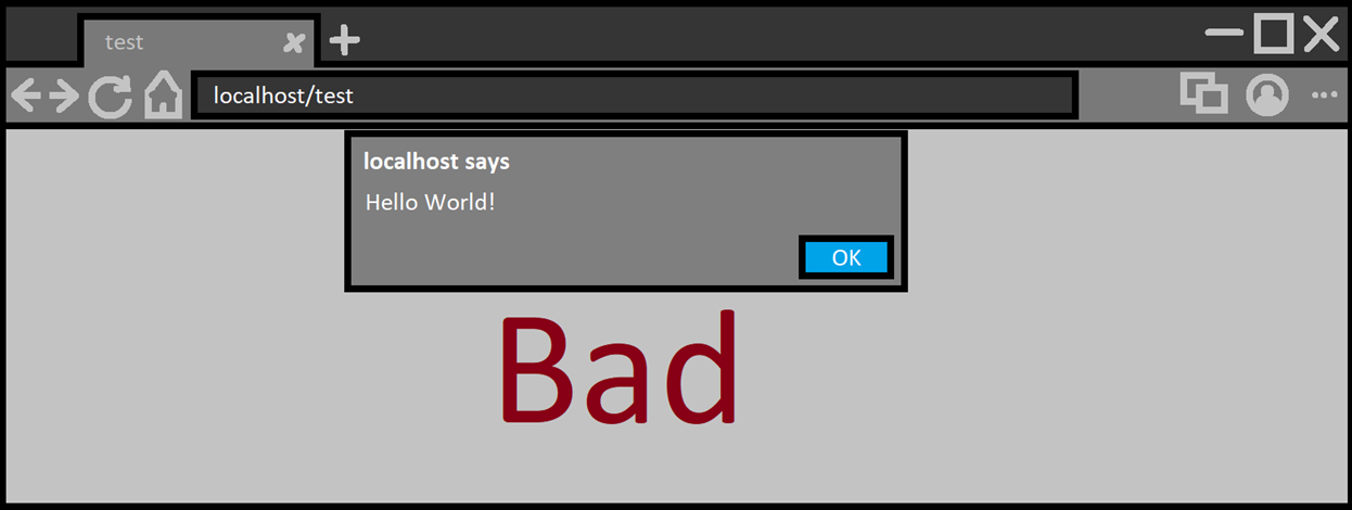
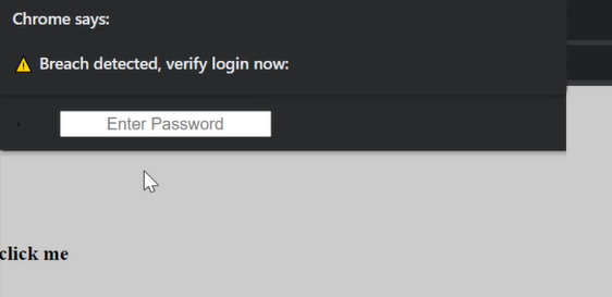
a. Browser prompts (think alert box, permission prompts and friends) should always cross the line of death to signify they are legitimate and originate from the browser. This is to ensure the UI cannot be spoofed within a webpage, since webpages cannot (or should not) be able to cross the line of death using JS/HTML/CSS.
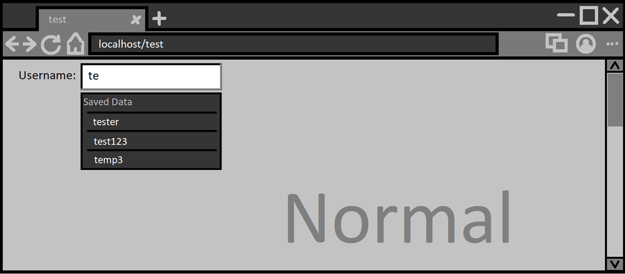
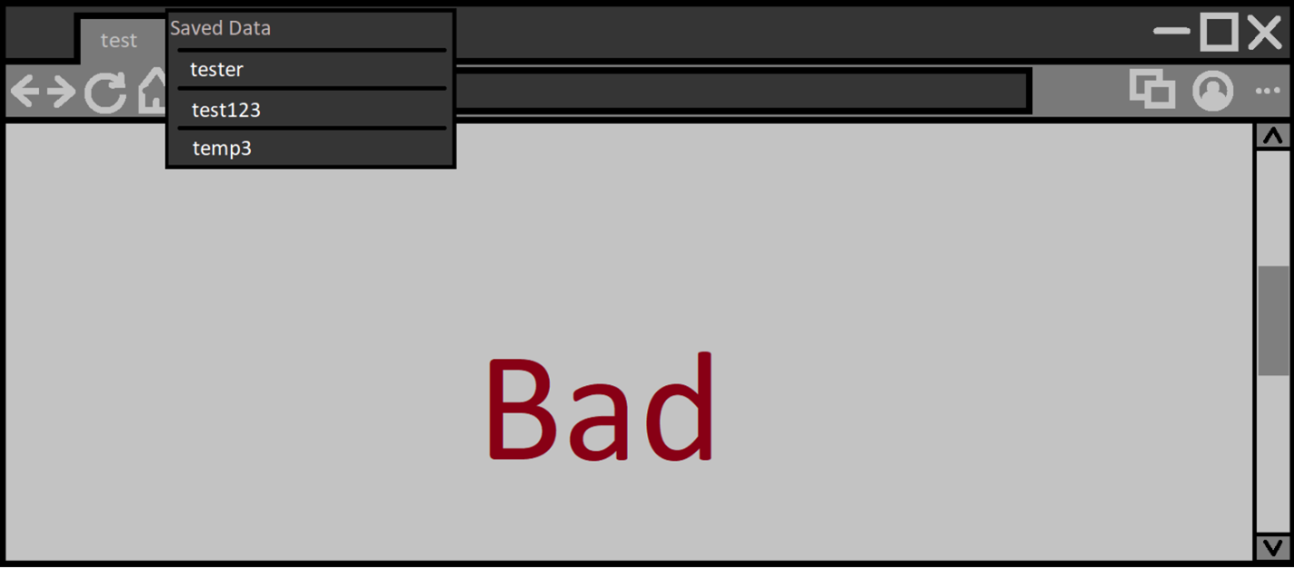
b. On the other hand, webpage UI (think autofill entries, dropdown selector, color picker and friends) should not cross the line of death. Make sure they only appear within the visible viewport. This is to ensure pages cannot cover important browser UI (omnibox, shyUI and permission prompts) or enable webpages to spoof browser UI.
Scrolling down a bit and activating the autofill again we could get:
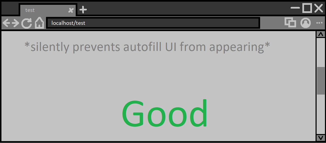
Not secure design. The proper behavior should instead look like:
Note: Alternatively, the page could scroll up and then show the autofill UI
2. Does it contain untrusted content?
If your UI displays text or images that are influenced by an untrusted external source, usually the visited webpage, then your UI should make that distinction clear. The end user should be able to discern between what the browser is saying vs. what the webpage is presenting.
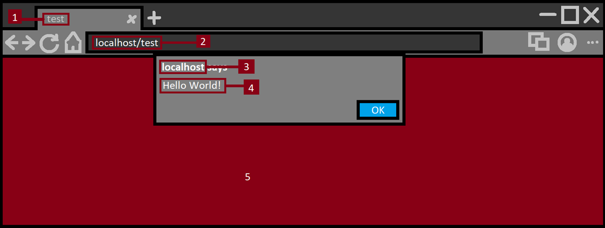
For example, let’s take the Javascript alert box. It’s a browser prompt that presents text provided by a webpage, but currently, it makes sure to mention that ‘example.tld says:’ at the very top. This makes it clear to the user that the text after that string is coming from the website and not the browser. Furthermore, these alert boxes will be blocked from being called within cross-origin frames since they have been abused to confuse users via spoofing.
Everything in red is untrusted. Let’s go one by one:
- Tab title: Untrusted text taken from the web page, basic sanity checks like ensuring no new lines in the title lead to text displaying outside its intended text box. Ensuring no HTML is rendered in there. This is also where the favicon of the website is rendered and ensuring the image is rendered and displayed safely so if there was any image processing memory corruption it won’t affect the browser process.
- Address bar: Important part of any browser which all users rely on to know what website they are on. Since this URL is taken from an untrusted source then extra care needs to be taken to ensure it is displayed clearly to end users.
- Alert origin: Domain name is untrusted, and some sanity checks should occur to make sure the domain name is clear.
- Alert text: This is text presented in browser UI which is taken from the untrusted page. Same checks as in (1) should be made here.
- Web content: This is the web page content; nothing here can be trusted.
3. Does it focus on a dangerous button/option?
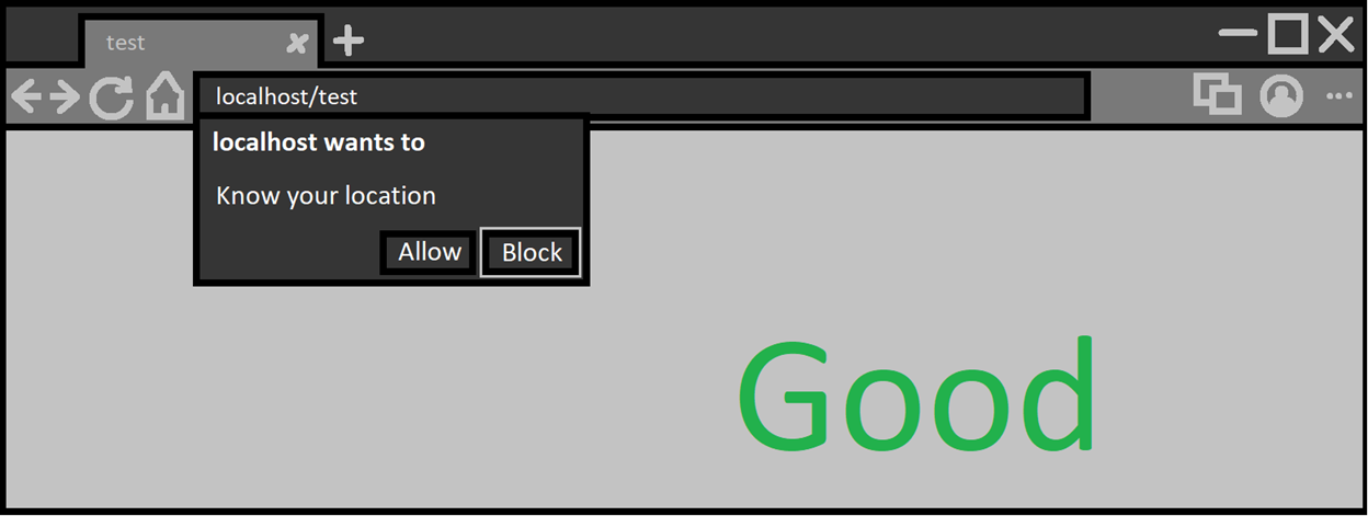
If the UI is asking the user to make a choice between options, then it should always default the focus on the least dangerous one. Alternatively, default focus should not be given to anything at all. For example, the permission prompt to allow a webpage access to a user’s geographic location shows two options: ‘Allow’ and ‘Block’. If you press ‘enter’ as soon as the prompt shows, then you will notice the ‘Block’ choice was chosen.
Otherwise, if the default focus is on a dangerous choice, attackers can use this to fool users into making that choice. Usually done by asking the user to hold down ‘enter’ and then showing the prompt.
This is one example of such a bug that affected multiple browsers.
4. Can it be called multiple times?
If the UI can be made to appear on demand by a webpage, then you should ensure it cannot be shown repeatedly in a short period of time. This is to prevent abusive phishing pages from repeatedly calling a UI to appear in a way that will confuse or scare the user and at worst trap them in a malicious page.
5. Can it be called without a user gesture?
Sometimes the UI needs to appear without a user gesture (for user ergonomics), if not, it’s best to only allow it to be shown if the user explicitly sends a mouse/keyboard/other gesture. Ensuring it consumes the user gesture will also help in mitigating any further abuse (with tricks like gesture laundering). In other words, one gesture per one displaying of UI.
If such a vulnerable UI is found, then attackers could use it to trap users and prevent them from leaving a website. If coupled with (4) it may prevent normal use of the the entire machine.
UI Security Bugs
When it comes to bugs that fail the (1.a)/(1.b) checklist, usually it is due to miscalculating the visible viewport.
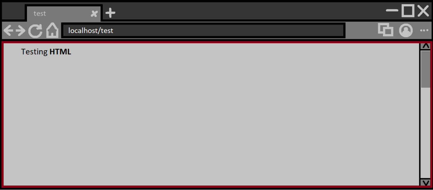
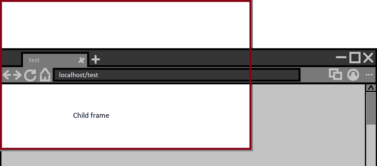
Take this example where the visible viewport has a red border.
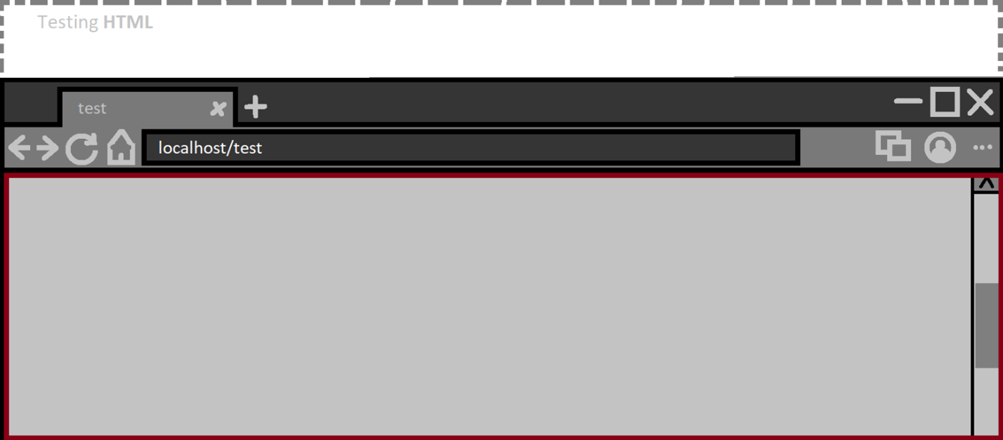
Scrolling down a bit and the visible viewport is the same. The part of the document that is not visible should never be considered as the visible viewport.
However, we are dealing with web content that has access to CSS as well as the ability to embed frames to other documents. Let’s look at the first example.
CVE-2020-15985: Cursor hijacking mitigation bypass
The mouse cursor is a piece of UI just like any other UI and webpages can automatically replace the cursor with a custom image. This feature has been abused to trap users by spoofing the real mouses location.
As a result, the following update was landed:
“[Deprecation] Custom cursors with size greater than 32x32 DIP intersecting native UI is deprecated and will be removed in M75, around June 2019. See https://www.chromestatus.com/features/5825971391299584 for more details.”
In other words, if a webpage replaces the cursor with a custom image greater than 32x32, then that custom image cannot cross into the browsers native UI in such a way that it can trick users. Some pixels are allowed to cross but not enough to create any reasonable attack.
However, it was found that when Chromium made the calculations of what is native browser UI vs what is visible web content, there was a possibility to confuse it by having an iframe host a page that replaces the cursor and then using CSS to make that frame start above the visible viewport of the main frame. Effectively bypassing the mitigation put in place.
1
2
<iframe src="large-custom-cursor.html"
style="width:700px;height:1000px;position:absolute;top:-100px;left:-100px;">
This PoC made the browser think the visible viewport (in red) was as follows:
Changes were made to ensure the browser will consider the top frames visible viewport. This bug is an example of (1.b) of the previously discussed checklist.
Autofill UI Multiple Issues
One feature you may have noticed and used at some point is the autofill feature. Say you sign up for an account at site ‘A’ with some basic information like username and password. Then later when you go to log into site ‘B’, that same entered username from site ‘A’ will appear as an autofill suggestion.
CVE-2021-21215 - Spoofing Browser UI
The autofill suggestion UI should not cover the browser UI as mentioned previously in (1.b) of the checklist. However, it turned out that it can be made to show above the browser native UI and cover important parts of the browser. But that alone is not a huge security issue in and of itself.
Here are the problems with abusing the autofill UI from an attackers perspective:
- Only shows saved entries from a previous form submission.
- Disappears when the user interacts with the browser or webpage.
- Only appears when user interacts with a form/input element.
We can solve (3) by simply asking the user to click anywhere on our malicious page. The input element can be transparent and cover the entire page. This way any click on the page will activate the mechanism which shows the autofill dropdown UI.
1
2
qf.style="opacity:1";
qa.style="width:100%;height:1000px;display:block;position:absolute;";
For (1) it is surprisingly simple to solve. We just need an iframe with a fake form that fills itself using Javascript and then executes formElement.submit() to some random URL. So we effectively control what is displayed in the dropdown autofill suggestion UI.
1
2
3
4
5
6
7
8
9
10
11
12
13
14
15
16
17
18
19
20
21
22
23
24
25
26
27
28
29
30
31
32
33
function createAutofillEntry(str) {
    let aframe = document.createElement("iframe");
    aframe.src = "#faker";
    aframe.style = "width:2px;height:3px;opacity:0.1";
    aframe["data-id"] = msgs;
    iframes[msgs] = false;
    msgs += 1;

    document.body.appendChild(aframe);

    aframe.onload = (e) => {
        if (e.target.contentWindow.location.search.length <= 10) {
            e.target.contentWindow.eval(`
          qb.value="pass1223"

          var thing="${str}";

          var i=0;
          var ger=0;
            ger=setInterval(g=>{
            qa.value+=thing[i];
            i++;
            if(thing.length==i){
              window.clearInterval(ger);
              qf.submit()
            }
          },20)
        `);
        } else {
            iframes[e.target["data-id"]] = true;
        }
    };
}
(2) was the most complicated of the three and was solved by doing two things:
- Populating all top window events with an event handler function that keep focus on the input element and returns
falseto ensure the event is canceled. - When the autofill dropdown UI shows, we switch the
input[type]=texttoinput[type]=buttonand since buttons don’t get autofill suggestions, it will confuse the browser and the suggestion UI sticks around.
1
2
3
4
5
6
7
8
9
10
11
12
13
14
15
16
setTimeout((g) => {
    qa.type = "button";
}, 100);

for (q in this) {
    if (q.indexOf("on") == 0) {
        this[q] = (e) => {
            if (e.type == "keydown") {
                qtext.value += e.key;
            }
            qa.focus();
            qa.click();
            return false;
        };
    }
}
Putting it all together into one final PoC and we will get the following behavior:
Video demo:
On Edge, this looks less convincing since its autofill UI clearly states what its purpose is (similar to alert box). However, this is still worth fixing.
So using a chain of small UI bugs in autofill we are able to create our own native browser UI and display any information we like. The PoC I made also shows off that we can extract keyboard data if the user is fooled into entering their password.
But wait, there’s more!
Extracting Private Information
Before getting into this bug, let’s first talk about placeholders. You see, when you interact with the autofill suggestion UI, by hovering over each suggested entry, something interesting happens. A placeholder value will be placed in whatever input/s you are trying to fill. This placeholder value should not be accessible by the web page. You can only read autofill data once the user explicitly picks an entry that they find appropriate. On top of that, placeholders will be set for all input with matching names. This means that creditcard numbers, addresses, usernames, fullnames and more can be extracted.
I first realized this subtle security issue from this bug (by Mark Amery) which used neat CSS/font tricks to extract placeholder data.
Now going back to the bug. I stumbled upon an interesting behavior whilst trying to figure out solutions to the problems I mentioned before (for the browser UI spoof). The bug (2) in the chain where I switched the types of the input as the autofill appeared resulted in the autofill UI to stick around. In this instance, all I did was instead of changing the input type, I instead made it so another autofill UI showed up as soon as the first autofill suggestion UI appeared. To break it down:
- User interacts with an input element ‘A’
- Autofill suggestion appears for input ‘A’
- Make autofill suggestion appear for input ‘B’
- Remove input ‘B’ from the document
What’s left is input ‘A’ with a placeholder value from the autofill suggestions without the actual suggestion UI being present. This is good for an attacker because now we have a lot of time to extract the data, where as before, the placeholder value is removed as soon as the autofill suggestion disappears.
Small PoC for that specific behavior:
1
2
3
4
5
6
7
8
9
10
11
12
13
14
15
16
17
18
hit down arrow
<Br><br>
<form id="qsub">
    <input id="qa" name=email placeholder="tester" type=text autocomplete=email>
</form>
<form name="addr1.1" id="paymentForm" action="" method="post">
    <input type="text" id="nameInput" name="name" autofocus>
</form>
<script>
    nameInput.onkeydown = (e) => {
        setTimeout((g) => {
            qa.click();
            qa.focus();
            document.execCommand("insertText", false, "\u0000");
            qa.remove();
        }, 215);
    };
</script>
I found two ways to extract this data and expose it to the web page:
CVE-2021-21177 - Drag and Dropping the placeholder value
One interesting function is document.execCommand('selectAll'); all this does is selects all texts within an editable document (we can set any element as editable by having the contenteditable=true attribute). I noticed when I executed this while a placeholder was stuck in an input, it would get selected. But because we cannot automatically copy and paste the selected value (without clipboard permission) then another way was used: Drag and Drop!
So now the exploit would look like so:
- Have user click on page
- Trigger placeholder persistence glitch
- Entice user to drag and drop part of the page
I already mentioned how (1) was done, for (2) I put a fake image of an iframe and when the user attempted to scroll down using the non-existent scrollbar they would be unknowingly drag and dropping their autofill placeholder values.
Video demo:
Link to the original PoC for the drag and drop case.
The initial discussions in the bug report seemed to be headed towards prevent drag and drop from applying to placeholder values. There is an already existing CSS that does this ` -webkit-user-select: none;`. But this was not enough, the main problem is the persistence of the autofill data.
Drag and drop is already a lot of user interaction so I wanted to see if I can replace it with a better approach at extracting the placeholder data. CSS and fonts seemed to not apply to placeholder data at all so I eventually stumbled on a different approach.
CVE-2021-21177 - Extracting placeholder value using window.find()
As soon as this function came to my mind I had to test it to see if works and it did!
If you don’t know, window.find() is a useful API that allows a webpage to perform a search for its own contents. Say you had a document with only the text Hello World then both window.find("Hello")==true and window.find("World")==true and of course window.find("doesntexist")==false.
With that, our full exploit will look like:
- User presses down arrow
- Trigger placeholder glitch
- Extract placeholders using
window.find
This meant that all the user needed to do is press the down arrow key on a malicious page and I would be able to extract a lot of private information. With the most damaging being creditcards.
Video demo:
CVE-2021-21216 - Hiding the autofill suggestion UI
There are a few UIs which should always be shown to the user. Most popular being the ‘You are now in fullscreen’ message that appears when you enter fullscreen. Since going fullscreen makes the head of the browser disappear then its trivial to replace it with a fake one which could easily be used to trick users.
It became clear to me that the autofill suggestion UI is as important as the fullscreen UI. This is because if it never appears then you can make the user press certain keyboard buttons and end up filling hidden input elements with autofill values without them realizing. A great bug that solidified this to me was this bug where the PoC is a game to get the user gestures required to extract the data.
Using a similar bug for the previously discussed native browser spoofing bug, I noticed that we can make the autofill suggestion UI ‘appear’ outside of the users screen. So in other words, I can make the autofill UI become invisible to the user.
To exploit this is straightforward:
- User visits malicious page that asks them to hit the down arrow (user does so)
- Hidden autofill appears somewhere outside the screen and chooses the first suggested result and subsequently fills multiple hidden inputs with placeholder values
- Malicious page asks user to hit ‘Enter’
That’s it. The user would be filling a hidden form with autofill data without realizing it. Here is a video if it in action:
Video demo:
Automating UI Security Bug Discovery
I had developed a tool that checked for UI issues, this was part of my education in how fuzzers work since I had never really used fuzzing before joining the team. This was a simple tool and barely a fuzzer, I say this because fuzzers usually find memory issues. A crash from a browser is a clear signal of something going wrong, but detecting UI issues has no such clear signal. So I made it so it had a mode where an observing user would manually choose whether something looks weird or not.
It turned out that I was able to find both memory issue bugs and design flaws all to do with UI. Before moving on let me describe how this simple automated tester works:
- Using a list of UI invokable by normal web content alongside their short PoC + I create a testcase that displays these UI’s randomly with a random order + Once the testcase is ran I run a type of a navigation
- Navigating through history
- Navigating to a new tab
- Opening a popup window
- Running the testcase in an iframe + (optional) Present two buttons indicating whether there is something weird or not
- On yes: testcase is saved and a new iteration begins
- On no: new iteration begins
This experiment did yield some interesting results both internally and externally.
heap-use-after-free in smartscreen::FlyoutShower (Edge only)
This internal bug was one of the first ones I found and it had to do with Smartscreen, something unique to the Edge browser. Smartscreen is Microsoft’s equivalent to Google’s Safe Browsing feature. Basically, it checks to make sure the files you download as well as the websites you visit are not marked as malicious.
However, the differentiation has to do with how Edge handles sites marked as a potential phishing website. If you navigate to this website on Edge right now you will see the following:
So naturally this was one of the UI evoking commands I put in the list for automation. Soon after, I saw that Edge was crashing, and it turned out to be a crash in the browser process.
1
2
3
4
5
6
7
8
9
10
11
12
13
14
15
16
17
18
19
20
21
22
23
<html>

<body>
    <script>
        const blob = new Blob(
            [
                `<iframe id="qss"
    src="https://nav.smartscreen.msft.net/other/areyousure.html"
    target="_blank" rel="noreferrer noopener"></iframe>`,
            ], {
                type: "text/html"
            }
        );
        var test = window.open(window.URL.createObjectURL(blob));
        var blank = window.open("about:blank");
        setTimeout(function() {
            blank.close();
            test.close();
        }, 1400);
    </script>
</body>

</html>
What happened was that the SmartScreen UI was not handling pointers to WebContents objects safely. In Chromium and Edge, the WebContents object is directly tied the lifetime of the tab. Since tabs can close themselves, given they have an opener, we can abuse self-closing tabs that invoke this UI and reliability hit a crash.
Using this technique, other minor UI related bugs were also found in Edge and upstream which either haven’t been fully fixed or aren’t that interesting.
CVE-2020-26953 - Bypassing Fullscreen UI In Firefox
As part of the BVR team we are encouraged to test some bugs or ideas in other browsers. Although the Chromium codebase is different than Firefox, the same design flaws could still be found in both. Another benefit is to see how Firefox deals with a certain behavior and gain insight from it.
During a weekend I decided to modify the tool I made to see how Firefox handles it, and one UI design bug kept appearing, but it did not always reproduce. This bug resulted in going in fullscreen and the UI notifying you that you are in fullscreen is completely missing.
The originally reported PoC had a mystery with it. It seemed like the only time it worked is if a websocket connection is made and failed. Not only that, but you had to keep changing it to another invalid location (assuming to bypass any caching).
One Mozilla employee (Gijs) pointed out that the mysterious websocket part of the PoC can be replaced with a console.log() call inside an unload handler. This change was a mystery to me, what does console.log have to do with fullscreen UI showing or not? Feel free to read the Bugzilla report it is public if you are curious to what made it work.
As suggested, I replaced the websocket connection with the unload handler and also added a blob navigation instead of navigating to the same page. Doing all that resulted in a more reliable PoC.
Video demo:
To me this was significant because it was found semi-automatically but also showed me the power of automating logical/design bug discovery.
It’s Raining Tabs
Tabs are part of UI and are arguably one of the more complicated UI in the browser. So when I noticed that a security bug was fixed in Tabs something clicked and I felt there has to be more bugs in this code. You see, with tabs, you can add them to groups, drag and drop, convert a tab from one window into a tab in another and vice versa and much more. And as mentioned before, tabs can close themselves (if they have an opener) which means the web content can control the lifetime of the tab.
All I did here was to make a script that opened tabs and those tabs closed themselves and then messed around with the different features of tabs during this continuous process of opening and closing tabs.
The following bugs were reported upstream and subsequently fixed:
CVE-2021-21197 - Heap buffer overflow in TabStrip
The main tab feature exploited here is the ability to drag and drop tabs into their own window. When a tab closed during dragging another tab into its own window, a crash was triggered.
Video demo:
CVE-2021-21192 - Heap buffer overflow in tab groups.
Again, drag and drop was leveraged here but instead of dragging a normal tab we are dragging a tab group out and into the main window whilst the tabs are closing.
Video demo:
CVE-2021-21154 - Heap buffer overflow in Tab Strip
You guessed it, dragging a set of tabs whilst some of them closed resulted in this crash. In this instance, the main tab feature of selecting tabs by holding down the shift key + selecting a range was used.
Video demo:
CVE-2021-21180 - Use after free in tab search
This has to do with a relatively new feature that gives users the ability to search their active tabs. I noticed this new tab search UI was actually a WebUI located at chrome://tab-search.top-chrome/
Within this tabsearch UI you can close tabs, but when you open ` chrome://tab-search.top-chrome/` in its own window and then try to close itself using the tab search UI closing mechanism a use after free occurs.
Video demo:
Conclusion
I hope that I left you with some insight into UI security and as you can see it is not purely a logical/design problem but can sometimes bleed into memory corruption issues. UI security is difficult to automate and fuzz for, even the memory issues around tabs required drag and dropping which not many (if any at all) fuzzers would bother simulating. It seems like UI security is a gap in the automation world and solving the problem of detecting it will very likely result in the discovery of many more bugs.
