MSEdgeExplainers
CSS ::tooltip Pseudo Element
Authors
- Alison Maher
- Lea Verou (author of the original proposal)
Participate
Status of this Document
This document is intended as a starting point for engaging the community and standards bodies in developing collaborative solutions fit for standardization. As the solutions to problems described in this document progress along the standards-track, we will retain this document as an archive and use this section to keep the community up-to-date with the most current standards venue and content location of future work and discussions.
- This document status: Active
- Expected venue: CSS Working Group
- Current version: this document
Table of Contents
Table of Contents generated with DocToc
- Introduction
- Goals
- Non-goals
- User research
- Existing and upcoming tools available for custom tooltips
- Current landscape of built-in tooltips
- The
::tooltippseudo element- How to trigger
::tooltipdefault styles? - How to set the
::tooltipcontent? - Positioning for
::tooltip ::tooltipsizing- Default styles for
::tooltip - What styles can be applied to
::tooltip? ::tooltipstyle inheritance- What user interaction triggers the built-in tooltip?
- Dependencies on non-stable features
- How to trigger
- Key scenarios
- Accessibility Considerations
- Security Considerations
- Privacy Considerations
- Open questions
- Future ideas
- Considered alternatives
- References & acknowledgements
Introduction
Tooltips are used by authors to provide additional contextul information to users for a given interactive element on the screen. Tooltips are often presented as a textbox that appears on hover (or potentially some other user interaction, like keyboard focus, or long-press on a touchscreen device) on the element the tooltip is associated with.
Authors can utilize the browser's built-in tooltips by setting the
title
attribute on an element of interest, or via the <title>
element in SVG. However, the tooltip that appears as a result is not
customizable in any way by the author.
This lack of customizability has been a source of common frustration for authors who want to keep a consistent look and feel across all of their UI.
This document explores a new ::tooltip pseudo element that aims to provide authors
with a low effort mechanism to adjust styles for browser built-in tooltips without
having to create a fully custom solution, leaving positioning, input handling, and
accessibility for their tooltips up to the browser.
Goals
- Provide a low effort way for authors to style core properties on browser built-in tooltips (for example, color properties, font properties, etc.)
- This mechanism should handle accessibility, positioning, and input handling for the author by default.
- Allow authors to override the default positioning behavior of the built-in tooltips.
- Allow authors to change the timing of built-in tooltips.
- Improve accessibility of the
titleattribute, particularly for keyboard users. - Guarantee security best practices, given that tooltips today can extend past the bounds of the browser window.
- Styling built-in tooltips should produce consistent results across all browsers on the same OS, ensuring an interoperable experience for authors.
Non-goals
- This proposal is not meant to support tooltips with arbitrary HTML content, which
can be covered by existing solutions, like
popover, CSS Anchor positioning, and the not-yet-availableinterestforattribute. - Provide a means to set a pointer on the
titlebased tooltip. The solution should be specified to allow for this functionality in the future, though.
User research
Use cases in this explainer were collected from the discussion in issue 8930. Additional inspiration was drawn from discussions in issues 9447, and OpenUI issue 730.
There are also many articles on the web that walk authors through various options for creating custom tooltips using tools available to them today. One such article walks through different options, along with various examples and use cases for tooltips on the web.
Existing and upcoming tools available for custom tooltips
If an author would like to adjust the style of their tooltip today, they must resort
to one of the following alternative approaches to the built-in tooltip that they
get with the title attribute.
Use an existing library or component
Authors can use an existing library or component for a fully customizable tooltip. Some example libraries include:
- https://fluent2.microsoft.design/components/web/react/core/tooltip/usage
- https://www.opentip.org/
- https://floating-ui.com/
- https://www.npmjs.com/search?ranking=popularity&q=tooltip
- Many more
It is clear that there are many libraries and components for creating custom tooltips that authors can use to solve their need for more customization.
If the library chosen is well architected to properly handle accessibility, this can also be a convenient way to get such functionality "for free". However, relying on external library to get accessibility right can be risky, which may limit the usability if not done correctly.
The other downside of this approach is that it requires heavy use of scripting, which can be slower, and shouldn't be necessary if the author simply wants to adjust some basic styles.
Create a fully custom tooltip
Authors can also choose to create their own custom tooltip or component, which requires their own input management, proper accessibility support and proper handling of the tooltip positioning, which can be complex.
This does allow authors to achieve their goal of full customizability, but it
often requires heavy use of scripting, or use of ::before or ::after
pseudos, which can make getting accessibility correct quite difficult.
As such, this solution requires a lot of work to get right, especially if all they want to do is adjust a few simple styles on the built-in tooltip.
Utilize popover, CSS anchor positioning, and/or interestfor
Although creating a custom tooltip can be cumbersome for an author who is looking to just adjust a few simple styles, they do have some new (and upcoming) web APIs, that can help them in accomplishing a fully customizable tooltip more easily:
- The
popoverattribute, which is baseline across browsers as of April 2024. - CSS Anchor Positioning, which is not yet baseline, but is part of the Interop 2025 effort.
- The
interestforattribute, which is currently being investigated, with a prototype already in working shape in Chromium.
One benefit that authors get with interestfor over the other existing solutions
is that it creates a more accessible experience out-of-the-box and handles input
handling for the author, creating a more seamless approach than is available with
the popoverattribute on its own. It is also a great solution if an author wants
custom HTML within their tooltip, as opposed to simple textual content.
However, interestfor does have some limitations. Currently, interestfor
is only allowed on buttons and links, which is more limited than the title
attribute.
All of these options do allow authors to create more custom tooltip experiences
than what is currently available through the browser's built-in option using the
title attribute, but these options often require more work than should be
necessary for a simple style adjustment.
Current landscape of built-in tooltips
The rendering of tooltips via the title attribute is up to each UA. Below
is a brief survey of how some of the top browser engines render built-in
tooltips today, in no particular order.
Simple tooltips across browsers
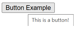
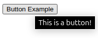
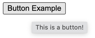
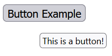
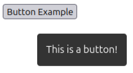
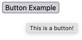
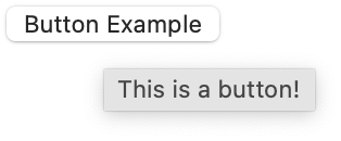
In this section is a comparison of basic tooltip rendering across each browser engine using the code example below.
<button title="This is a button!">Button Example</button>
Chromium
In Chromium, the tooltip is rendered above all web content, and the position of the tooltip is dependent on the position of the mouse and the element it is anchored to.
The style of the tooltip that is rendered is very simple: a white or black background with black or white text and a matching border.
On Windows the simple test case above renders as follows:
On Linux, the style of the tooltip defaults to a darker color scheme:
On MacOS, Chromium leaves the rendering up to the OS itself, producing the following result:
On mobile, tooltips are not activatable in Chromium, with the exception of tooltips on an image, which do appear in the context menu upon long press on Android.
Gecko
In Gecko, the tooltip is similarly rendered above all web content, and the position of the tooltip is dependent on the position of the mouse and the element it is anchored to.
The style of the tooltip that is rendered is arguably more modern in style than Chromium and has more of an offset from the anchored element.
On Windows the simple test case above renders as follows:
On Linux, the style of the tooltip defaults to a darker color scheme, with no border, and slightly more padding:
On MacOS, Gecko matches the OS tooltip styles, producing the following result:
On mobile, tooltips are not activatable in Gecko, with the exception of tooltips on an image, which do appear in the context menu upon long press.
Webkit
In Webkit, the tooltip is similarly rendered above all web content, and the position of the tooltip is dependent on the position of the mouse and the element it is anchored to.
The style of the tooltip that is rendered is in accordance with the platform, similarly to Chromium and Firefox on MacOS.
On mobile, tooltips are not activatable in Webkit, with the exception of tooltips on an image, which do appear in the context menu upon long press.
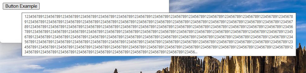
Longer tooltips across browsers
Below is an overview of how each major browser engine handles longer tooltip text, in no particular order.
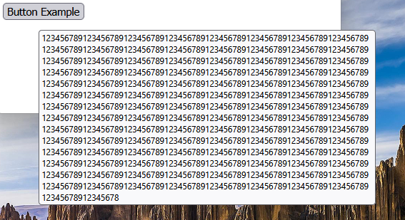
Chromium
In Chromium, built-in tooltips add ellipses to the tooltip text if the text is greater than or equal to 1025 characters. The tooltip is also allowed to escape the bounds of the window. For example:
Gecko
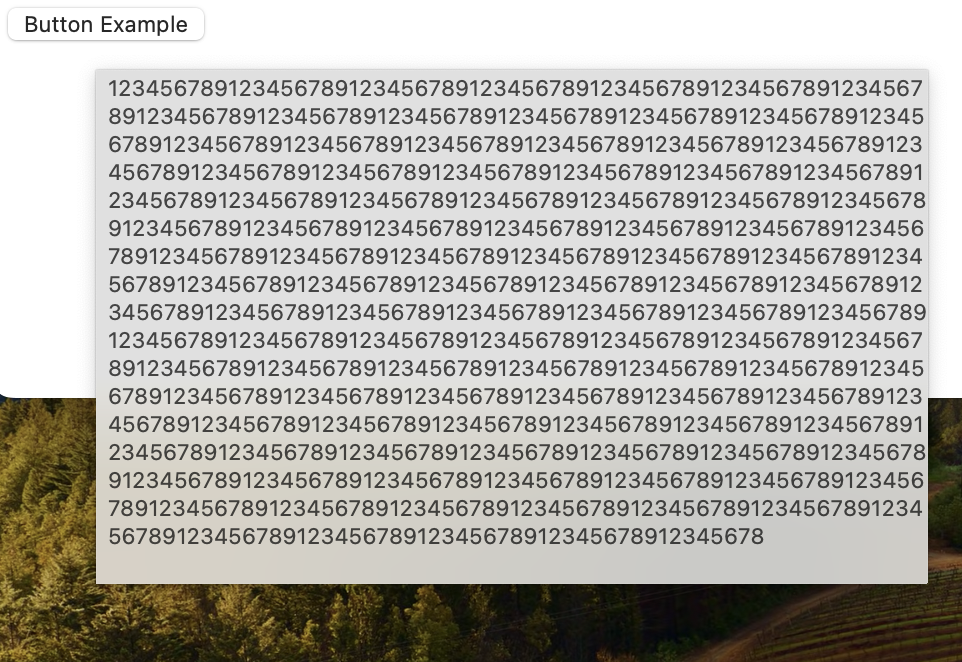
In Gecko, I was not able to find a limit for built-in tooltip length for which an ellipses was added, like it does in Chromium. However, tooltips are also able to escape the bounds of the window in Gecko, but the tooltip width stays more constrained than in Chromium. For example:
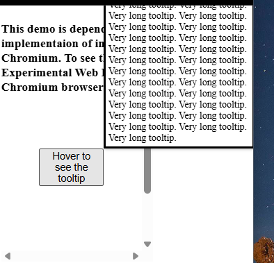
Webkit
In Webkit, I was not able to find a limit for built-in tooltip length for which an ellipses was added, like it does in Chromium. However, tooltips are also able to escape the bounds of the window in Webkit. In this case, the tooltip appears to have uneven padding. For example:
It is clear that the tooltips provided by the top browser engines are inconsistent in styling between each other and across OS, and there are divergences in positioning and some behaviors with longer tooltip text.
This inconsistency and lack of customizability leads authors to find alternatives that often require more work and maintenance.
The ::tooltip pseudo element
Many have proposed a pseudo for styling browser tooltips over the years, with the first proposal originating around April 2000, and the most recent proposal from Lea Verou in 2023.
The proposal in this document takes close inspiration from these, by
introducing a new pseudo element, called ::tooltip, that can be
used by authors to style the browser tooltip that is displayed when
the title attribute is set on an HTML element.
The ::tooltip pseudo element will have default UA styles that will
be required to be applied when an author adjusts tooltip styles
within a ::tooltip pseudo element selector.
The idea behind this proposal is that authors would be able to create simple text-based tooltips, and adjust the styles of color properties, shadowing, border properties, font properties, etc to better match the look and feel of their site, leaving positioning, input handling, and accessibility up to the browser.
How to trigger ::tooltip default styles?
Currently, browser default tooltips are triggered by the title
attribute being set, or by the presence of the <title> element for
SVG elements.
We could have the default ::tooltip apply in all cases by default,
but this may be a breaking change for some browsers. Instead, the UA
should be able to style tooltips in their own chosen way, unless
::tooltip is triggered in some way.
Authors may also want to trigger this path without triggering any
styles beyond those that are default. As such, there requires
some mechanism for authors to trigger the new ::tooltip-based
default.
An initial suggestion would be to utilize appearance: base, similar
to what was done for customizable select elements, that an author can use within the ::tooltip
pseudo element to trigger the new base default styles and
customizability.
For example, in order to set the color of your tooltip to red,
one could apply the following styles:
::tooltip {
  appearance: base;
  color: red;
}
The downside of this is that it requires explicit opt-in, rather than
only needing to set the color to red, but would allow an author to
trigger the new base tooltip styles without having to set any styles.
This triggering mechanism remains an open question and is welcome
to additional suggestions and input from the wider community.
How to set the ::tooltip content?
There has been debate in the most recent proposal
for ::tooltip for how best to set the content of the ::tooltip
pseudo element.
The content itself will be pulled from the title attribute, or in
the case of SVG, the <title> element. The initial proposal is to
utilize the content property for applying the content to the
::tooltip pseudo element itself.
The initial suggestion by Lea Verou in the CSSWG proposal was to set this via the default stylesheet in the following manner:
::tooltip {
  content: attr(title);
  ...
}
There were some concerns that this wouldn't work well for SVGs,
since SVGs use <title> instead of the title attribute for
built-in tooltips. @bleper put
together a potential proposal
for how to address this issue.
However, a simpler approach may be to define what normal means
uniquely for ::tooltip such that normal is equivalent to
content: attr(title) in all cases, but SVG, where in SVG,
normal is equivalent to the content of the <title> element.
This item remains an open question and is welcome to input from the wider community.
Positioning for ::tooltip
There has been discussion in the CSSWG around whether the positioning
of ::tooltip should be UA magic, or if the author should be able to
customize this. The main concern being around security, given that
tooltips can escape the bounds of the browser window today (see
Security Considerations for more details).
Given the proposal to not allow tooltips styled through the
::tooltip psuedo element to escape the bounds of the windows (see
Security Considerations for more details),
this proposal also includes the ability for authors to customize the
tooltip positioning.
As such, this proposal will utilize CSS Anchor Positioning to define the default
position of the ::tooltip pseudo element, which will allow authors
to override this in the way that they see fit.
As a result, this means that the element associated with the title
attribute (or <title> element in the case of SVG) will be an implied
anchor for the rendered tooltip.
::tooltip sizing
This proposal sizes the default ::tooltip-based tooltip according to
default sizing definitions (where the size of the tooltip is based on
the size of its content.) This also means that the tooltip will be
constrained by the viewport in the inline direction, but may overflow
the viewport in the block direction, if too large, as depicted in
the image, below.
We could instead consider whether the default tooltip in this case should
have a non-default sizing definition. For example, the width of the
tooltip could be constrained to be no larger than some percentage of
the viewport width using the max-width property.
This, and whether authors should be allowed to adjust the sizing
properties within a ::tooltip pseudo element, remain open
questions for further discussion.
Default styles for ::tooltip
When the new default ::tooltip styles are triggered via the
appearance property, a set of default styles would be applied
by the UA.
These styles were mostly pulled directly from Lea Verou's initial
proposal with a couple of
minor edits based on the new proposal for an updated definition of
content: normal within the ::tooltip pseudo element, as well
as the proposal to define the position via CSS Anchor Positioning
(which was included as an option in Lea's original proposal, as
well).
/* UA styles */
::tooltip {
  /* content: normal; is implied */
  color: InfoText;
  background: InfoBackground;
  font-size: .8rem;
  box-shadow: .1rem .1rem .2rem rgb(0 0 0 / .2);
  position: absolute;
  position-area: top right;
  position-try-fallbacks: top left, top center, bottom right, bottom left, bottom center, center right, center left;
  transition: 0s 3s visibility;

  @starting-style {
    visibility: hidden;
  }
}
These proposed set of initial UA styles is a starting point and is open to further discussion.
To see some of these styles in action, check out the CodePen demo utilizing interestfor
to render the tooltip. You'll note that this requires some changes
to the styles above (notably, this doesn't include the defined
transition and sets margin to 0 to account for the default
popover styles). Since this is based on interestfor, at the
time of writing, this demo is required to be tested in a Chromium-based
browser with Web Platform Experimental features flag enabled.
What styles can be applied to ::tooltip?
Not all styles should or need to be applied within the context
of a simple text-based tooltip. For example, we likely don't
want tooltips with images, lists, scrollbars, or non-default
display types or z-index. As such, there should be a limited list
of styles that are valid within a ::tooltip pseudo element; that
list can be expanded on in the future.
There is an open CSSWG issue to discuss what
properties should be styleable within a ::tooltip pseudo element.
As such, the complete list of properties is up for discussion, but
as the proposal notes, the core set of properties should include:
contentfor setting the text displayed in the tooltip (whether authors should be allowed to change this is up for debate, as it may have some accessibility implications if the tooltip andtitlehave different text)appearanceas a means to trigger new default tooltip styles- All font properties,
text-transform,letter-spacing,word-spacing, and the i18n text properties background,color,box-shadow,text-shadow,border-radius,border,padding,opacity(including their longhands)color-schemeandforced-color-adjust(these two were not included in the initial CSSWG proposal, but would likely be helpful for authors to guarantee consistent theming capabilites with the rest of their page.)- Transitions
transform,transform-origin,rotate,scale,translate- Custom properties
- Given that the proposal suggests using anchor positioning for
default styling of the position of
::tooltip, we should also include CSS Anchor Positioning properties for author customization
The list above should handle the majority of styling use cases for authors, however the current proposal also notes that the following properties would be nice to have, as well:
clip-path- Filters and
backdrop-filter animationmix-blend-modeborder-imageoutlinetext-decorationfillandstroke
As noted, the first list of valid properties is still up for debate, so any thoughts or input are welcome as we continue to explore the open issue.
::tooltip style inheritance
To allow ::tooltip to inherit styles from the rest of the page,
it should be grouped within the list of Tree-Abiding
Pseudo-elements.
This would allow ::tooltip to inherit properties, like font-family,
from the rest of the page, making it easier for authors to create
a consistent look and feel across all their UI.
What user interaction triggers the built-in tooltip?
Currently, browsers show title-based tooltips when a user hovers
over the element associated with the tooltip.
No major browser engine appears to currently support touch interactions
for these built-in tooltips, except for tooltips on images. However, this should
be something for browser vendors to consider along with support for
::tooltip, similar to what is proposed with interestfor.
All browsers, except Microsoft Edge, also do not invoke the title-based
tooltips on keyboard focus. See Accessibility Considerations for more details.
Authors may also want to be able to customize the interaction(s) that
trigger built-in tooltips using the ::tooltip pseudo element. This
functionality is being considered as a future addition
to this proposal.
Dependencies on non-stable features
This proposal makes use of CSS Anchor Positioning, to define the default
positioning of the base ::tooltip styles. This feature is not yet
baseline, but it is part of Interop 2025.
There is also a thought on whether ::tooltip should be defined to be
based on interestfor, given there is an overlap between the two
features. However, this is something that should likely be left up to the
UA on the technology involved in rendering their tooltips, as long as
the base set of styles and specified interactions are met.
Key scenarios
Scenario 1: Opt-into the new base ::tooltip styles
In its most base form, an author could opt-into the new ::tooltip base
styles without adjusting any of its styles in order to get a consistent basic
styling for tooltips across browsers. An author could accomplish this with
the following HTML and CSS.
<style>
  ::tooltip {
    appearance: base;
  }
</style>

<button title="This is a button!">
  The tooltip shown will follow the UA base styles across all browsers.
</button>
Scenario 2: Adjusting the look and feel of built-in tooltips
If an author doesn't like the base ::tooltip style, they can adjust the
styles as follows:
<style>
  ::tooltip {
    appearance: base;
    background: orange;
    color: blue;
  }
</style>

<button title="This is a button!">
  The tooltip shown will have a blue background and orange text.
</button>
Scenario 3: Adjusting tooltip timing
An author may not like the timing of the built-in tooltip popup. An author
can change this by adjusting the tooltip transition, as demonstrated in
the example below:
<style>
  ::tooltip {
    appearance: base;
    transition: 0s 1s visibility;
  }
</style>

<button title="This is a button!">
  The tooltip shown will be shown more quickly than the default UA
  provided styles.
</button>
One may find it is strange that an author could adjust the transition
of the visibility property, without being able to update the visibility
property itself. This is because the UA owns the user interaction, and as such,
the UA owns the resulting visibility of the tooltip.
Disallowing author control of visibility itself allows UAs to lazily calculate
tooltip styles under the ::tooltip pseudo element until it is determined by
the UA to display the tooltip itself. If an author were able to adjust
visibility, we would need to calculate ::tooltip styles for all elements
to determine if the tooltip would be shown or not, which would be less
performant.
Although we don't allow author adjustment of visibility, authors may still
find it useful to adjust the timing the tooltip is shown, which we are proposing
can be accomplished via adjustment to the transition defined in the UA default
styles for ::tooltip.
Scenario 4: Setting the name using title without rendering a tooltip
There is no existing way to set an accessible description for most
elements without using ARIA or without a tooltip being shown (via
the title attribute).
We can consider making this possible through the ::tooltip proposal
utilizing content: none as follows:
::tooltip {
  appearance: base;
  content: none;
}
Whether authors should be able to change the content of these tooltips
is still an open question. There may be accessibility implications with
allowing the tooltip text to be different than the title. If we decide
that is not allowed, this would require a different mechanism (like
utilizing visibility) if we want to support this use case for authors.
Scenario 5: Providing custom positioning to a tooltip
Given that this proposal uses CSS Anchor Positioning to define the base
positions of the ::tooltip pseudo element, this would open up an
opportunity for authors to adjust these styles, similar to the example
below:
::tooltip {
  appearance: base;
  position-area: start span-all;
}
Accessibility Considerations
According to the WCAG, “Content which can be triggered via pointer hover should also be able to be triggered by keyboard focus.” As such, tooltips should also be keyboard accessible, and per guidance should also be dismissible.
What is the current accessibility experience of tooltips across browsers?
Unlike interestfor,
the title attribute is allowed on any element, even if that element
isn't interactable. This can pose problems for accessiblity, because
if the element isn't focusable, it means that the associated tooltip
is not keyboard accessible.
On top of this, no browser, outside of Microsoft Edge, exposes the built-in tooltip on focus, even if the associated element is focusable. This means that browser built-in tooltips are not accessible out-of-the-box, which is one of the goals of this proposal.
Proposed improvements
To improve the current situation, the ::tooltip element cannot be
triggered or styled if the element associated with the tooltip is
not focusable.
As part of this effort, browser vendors should also work on triggering their built-in tooltips on focus when the element associated with the tooltip is focusable, and utilize the escape key to trigger tooltip dismissal.
One consideration for improving this further is to force existing
elements with an associated title-based tooltips to have a
tabindex of 0 if it is not already focusable. However, this is
not ideal, as it could lead a container to become focusable that was
not before, leading to undesirable focus changes if a user incorrectly
applies focus just outside of a target element within that container.
An alternative for browser vendors to consider is including a user
setting that forces a tabindex of 0 in such cases, allowing the
user more control over the resulting behavior as they see fit.
Creating a more accessible tooltip experience for users is one of the key goals of this proposal, so additional ideas from the community that should be considered to help in further improving the current situation are very much welcome.
Zoom
Built-in tooltips today do not adhere to user preferred zoom levels, making them less accessible than the content they are associated with.
Making these tooltips stylable through the new ::tooltip pseudo
element should allow for a more accessible experience in such
scenarios.
Security Considerations
As noted in the section on the current landscape of built-in tooltips, browser built-in tooltips are currently allowed to escpape the bounds of the browser window.
For tooltips styled via the ::tooltip pseudo element, UAs must instead
stay within the bounds of the web page. This would avoid security concerns when rendering
outside the bounds of the browser window, which becomes exacerbated when
styleability is involved, because this can more easily trick users into
clicking on a spot on the screen that could lead to a security vulnerability.
This behavior would be limiting for Iframes in particular, as this would mean that tooltips in such scenarios would also not be allowed to escape the bounds of the Iframe window. This, however, would be consistent with the behavior authors get with custom JS tooltips already, so applying the same restriction here likely wouldn’t be a major downgrade for authors.
With styled tooltips being constrained to the browser window bounds, depending on the UA choice for rendering technology, UAs will need to ensure that the tooltip remains isolated from the rest of the document and the resulting layout, as to ensure that styled tooltips do not cause unexpected side effects on page content, which is guarenteed of tooltips across browsers today.
Privacy Considerations
There are no known privacy considerations to take into account as part of this proposal.
Open questions
- What styles should be allowed within the
::tooltippseudo element? - Should
::tooltipbe based oninterestforor should that detail be left up to the UA? - Should we consider another method for triggering
::tooltipand its base styles than theappearanceproperty? - Is
contentthe best mechanism for setting the tooltip text fromtitlewithin the::tooltippsuedo element? - Should authors be allowed to change the
contentof the::tooltip? - Should authors be able to change the positioning of a
::tooltipor should this be magic left up to the UA? - Should authors be able to customize the size of the
::tooltipthrough sizing properties? - What are the right default UA styles for
::tooltip? - Does it make sense for
::tooltipto be a Tree-Abiding Pseudo-element? - How should
::tooltipinteract withinterestforand any otherpopoveron the same element? - Are there other ways we improve the current accessibility landscape
of the
titleattribute? - Should the text within
::tooltipbe selectable? - How should
::tooltipbe represented in the DOM tree? - Should we use
visibilityfor showing the::tooltiptransition, orposition-visibility? Ifposition-visibility, we may want to consider adding a new value for "always hidden". - Should tooltips generate their own events?
Future ideas
Tooltip pointer/arrow
Many authors like to add a pointer, nub or arrow with their tooltip, to create a clearer tie between the tooltip and its associated content, as illustrated by the below screenshot from Wikipedia:
A future consideration for ::tooltip is to add a way for authors to include
a pointer/arrow with their tooltip that is associated with their ::tooltip
psuedo.
This addition would require allowing sub-psuedo elements within ::tooltip.
There would also need to be a way to know the position of the tooltip itself
to position the arrow against, which can be accomplished with CSS Anchor
Positioning, along with the proposed ::tether pseudo element.
Customizing ::tooltip user interactions
For now, the UA will control the user interactions that trigger a built-in tooltip, but authors may wish to change the interaction behavior. Exploring options to allow more author control of these interactions will be considered in future versions of the feature.
CSS Anchor Positioning tooltip defaults
If an author would like to produce consistent positioning that is acheived
with ::tooltip when creating fully custom tooltips via interestfor or other
methods, we may want to consider adding new keywords to CSS Anchor Positioning
properties for the default behavior defined for ::tooltip in the UA stylesheet.
This would allow authors to more easily create a consistent postitioning behavior as built-in tooltips.
Considered alternatives
Alternative 1: The interestfor attribute
interestfor is a great solution for authors when creating custom tooltips.
However, if an author is only adjusting a few simple styles, interestfor may
be a bit more cumbersome than utilizing the browser built-in tooltips and adjusting
such styles in CSS.
interestfor is also limited to links and buttons, although this restriction
could be expanded in the future.
References & acknowledgements
Many thanks for valuable feedback and advice from:
- @bleper
- Andy Luhrs
- Benjamin Beaudry
- Daniel Clark
- Dominik Röttsches
- Hoch Hochkeppel
- Kevin Babbitt
- Kurt Catti-Schmidt
- Lea Verou
- Mason Freed
- Scott O'Hara
Thanks to the following proposals, projects, libraries, frameworks, and languages for their work on similar problems that influenced this proposal.
- A special thank you to Lea Verou for her detailed proposal of
::tooltipand for reviving the idea in the CSSWG, which was a valuable source of inspiration for this document. - Thank you to Tantek Çelik, whose original proposal kicked
off discussion for
::tooltipback in April of 2000. - Thank you to Scott O'Hara, who also recently brought a similar proposal to the OpenUI group.